Esports organizations obsess over branding because it is the only asset they reliably own. Players leave, leagues restructure, and games themselves belong to publishers — but the logo, the colors, and the mascot persist, and they must carry fan loyalty across every roster churn cycle. Team Solomid and Fnatic, both founded in 2004, outlived dozens of complete roster rebuilds on the strength of institutional identity; the org is the continuity, and the org is largely a design problem. That is why rebrand announcements get treated like major news in a way traditional sports fans would find strange.
Academia Hagi is an independent online publication covering gaming culture and business — not a branding agency, and not affiliated with any organization discussed. Herewith the culture of competitive identity design.
What does a mascot actually do for an esports org?
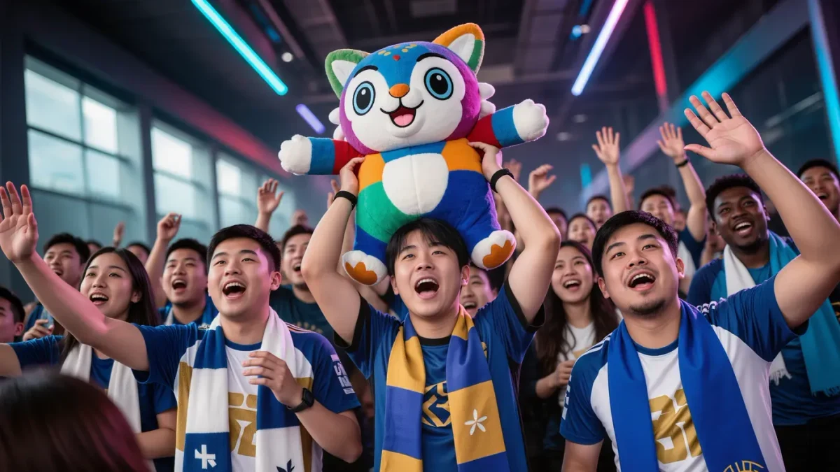
Three jobs, all emotional. First, embodiment: a mascot gives the abstract organization a face that can appear on a jersey, a plush toy, or an arena screen without paying a salary. Second, merchandising: the mascot is the most printable asset an org owns — the character that sells hoodies to fans who cannot name the current mid laner. Third, content: mascots meme. A costumed character reacting to a match loss is infinitely clippable, and in an attention economy, clippable is a business model.
The difference from traditional sport is instructive: a football club's mascot decorates a century of accumulated meaning, while an esports org's mascot must generate meaning from a cold start, in months, for an audience that is mostly under thirty and allergic to being marketed at.
Why do esports rebrands happen so often?
Because identity is one of the few levers an org can actually pull. An organization cannot patch the game, control the league's format, or guarantee results — but it can redesign itself overnight, and a rebrand generates news cycles, social engagement, and a merch drop on schedule. The danger is the crowd's memory: communities archive old logos and treat discarded identities with real nostalgia, so a rebrand risks reading as betrayal of the very history it was meant to refresh. The orgs that navigate this best evolve their design language gradually; the ones that whiplash from aesthetic to aesthetic end up with brand equity resembling a slot-machine outcome.
- Identity continuity: fans need to recognize the org across a decade of roster turnover.
- Merch printability: simple silhouettes and two-color schemes beat intricate art at hoodie scale.
- Meme tolerance: a mascot that can survive being joked about is worth more than one that cannot.
- Regional anchoring: city branding ties orgs to place in a scene that is otherwise placeless.
How did the visual language of esports branding develop?
Fast, and in two waves. The first wave, the 2000s and early 2010s, was clan aesthetics: aggressive animals, sharp serifs, and colors that looked strong on early streaming overlays. The second wave, professionalization, borrowed from sport and streetwear — cleaner marks, retro-trimmed varsity styles, and collaborations with fashion brands as competitive gaming sought mainstream legitimacy. The pendulum is now visibly swinging toward heritage play: young organizations designing themselves to look older than they are, because longevity itself is the flex in an industry famous for impermanence.
| Era | Dominant look | What it signaled |
|---|---|---|
| Clan era (2000s) | Aggressive fauna, sharp type, neon | Competitive intensity, internet nativity |
| Professionalization (2010s) | Cleaner marks, sport-adjacent kits | Legitimacy, sponsor safety |
| Heritage wave (2020s) | Retro trims, faux-vintage crests | Survival, institutional weight |
Each wave kept the previous one's core requirement: the mark must read at 32 pixels, because most fans will only ever see it as a stream overlay or a social avatar.
How do mascots survive the meme economy?
By being mockable on purpose. The strongest esports mascots are designed with a flaw — an earnest intensity, an absurd proportion, a slightly too-serious expression — because flawlessness is unshareable and charm is a vulnerability the community can love. Marketing departments learned this the hard way: a mascot introduced with maximum polish tends to get ignored, while one the community can remix becomes collaborative property, redrawn, captioned, and enlisted into match-day rituals the org never planned. The mascot's highest achievement is escaping the brand team entirely and living as folklore.
The lifecycle economics reward this. A mascot that memes its way into community affection compounds value yearly — appearing in fan art, chant variations, and arena banners — at zero marginal cost to the organization, while a failed mascot is a write-off that haunts highlight reels forever. This is why identity design in esports has drifted from imposing toward endearing, and why the most durable marks in the scene are the ones fans feel they own a share of. The org holds the trademark; the community holds the meaning; the mascot works only when both sides keep pretending not to notice the arrangement.
Does branding actually create loyalty, or just merchandise?
Both, and the loyalty part is stranger than the merch part. Fans form genuine parasocial attachments to organizational identities — the colors become a family inheritance, the mascot a shared inside joke — precisely because everything else in esports is volatile. Supporting an org rather than a player is a bet on continuity in a scene that offers very little of it, and that bet is emotionally load-bearing. Communities prove it every time a legacy mark is retired: the mourning is real, disproportionate to any rational valuation, and deeply informative about what fans think they are actually supporting.
A jersey with no player on it is the purest expression of what an esports org sells: the promise of being a fan tomorrow, of someone specific.
What comes next for org identity?
More territories: esports orgs now extend their marks into content houses, apparel drops, and partnerships far from competition, following the streetwear model where scarcity and community outrank performance. The mascot, meanwhile, is quietly gaining stature as an AI-adjacent content property — animated, reactive, posting — a mascot that comments on matches can work daily in a way a logo cannot. The underlying bet never changes. Games are leased, players are rented, and leagues are restructured; the identity is the deed. Organizations obsess over mascots and branding for the same reason a ship's crew paints the hull: it is the part of the vessel that must survive every voyage.